Readable
Comfortable typography and content spacing at every viewport.
 EVOLVENET
Mobile-first web design Birmingham
Evolvenet designs fast, intuitive websites that adapt beautifully to every screen—giving customers a clear, consistent path from first visit to enquiry or sale.
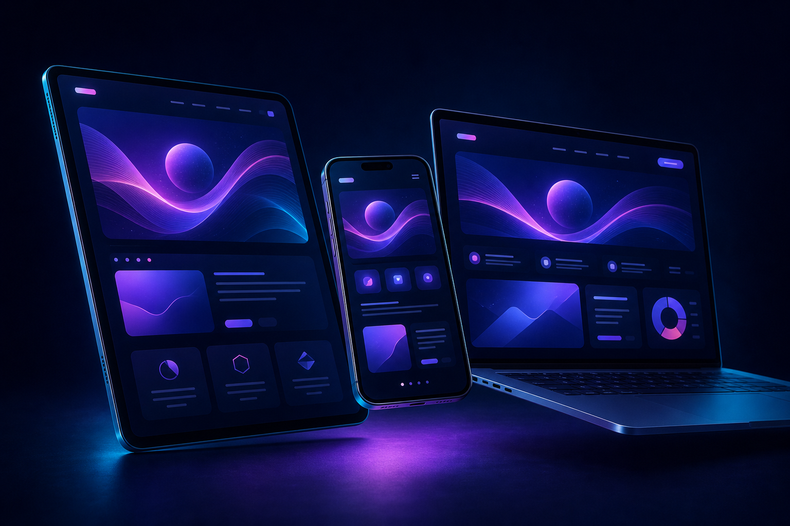
What responsive design means
A responsive website uses flexible layouts, media and navigation patterns to respond to the available screen. Text remains readable, images remain proportional and calls to action stay easy to reach without pinching, zooming or hunting through a cramped menu.
Our mobile-first approach starts with the essential content and customer task. We then enhance the experience progressively for tablets, laptops and large displays, making deliberate use of the additional space.
Comfortable typography and content spacing at every viewport.
Controls sized and positioned for thumbs, fingers and keyboards.
Layouts recompose intelligently rather than simply shrinking.
One brand and conversion journey across every device.
Designed for how people browse
Customers often discover a business while travelling, comparing options or looking for an immediate answer. The experience must make sense within seconds.
Built beyond the breakpoint
Changing columns at a certain width is only the beginning. We consider the entire experience behind the layout.
Appropriately sized images, lean front-end code and stable layouts help pages feel quick and dependable.
Calls to action remain visible and appropriate as the context changes between mobile and desktop.
Keyboard access, semantic content, contrast and comfortable targets support a wider audience.
One crawlable content experience, clean structure and strong performance support ongoing SEO.
Cards, media, tables and long-form content adapt without losing meaning or visual hierarchy.
A resilient design system accommodates new devices, content and business requirements over time.
Performance considered
A visually responsive layout still fails if visitors wait too long or the page shifts beneath their finger. We design and build with loading speed, interaction responsiveness and visual stability in mind.
Our responsive process
Define the content and actions customers need most.
Plan mobile journeys before expanding the layout.
Create a fluid visual system across key screen sizes.
Build flexible components with accessible interactions.
Review real content across phones, tablets and desktops.
Common questions
Have an older website or a new mobile-first project in mind? We can help you choose the right route.
Responsive design allows layouts, navigation, images and content to adapt intelligently to the visitor’s screen—from mobile phones and tablets to laptops and large displays.
Starting with mobile prioritises essential content, touch-friendly navigation and clear actions before additional space and enhancements are introduced for larger screens.
Some websites can be adapted, but older layouts often benefit more from a considered redesign that improves structure, speed, accessibility and conversion paths together.
It provides one consistent URL and content experience across devices. Search performance also depends on content, technical structure, speed, accessibility and authority.
Upgrade the mobile experience
Tell us what your customers need to achieve. We will recommend a responsive approach built around their journey and your business goals.